So far every time I've used Qt applications under GNOME, especially VirtualBox, I've found the Qt font rendering to be appalling. See this screenshot of VirtualBox alongside the GNOME appearance dialog:
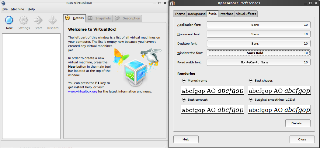
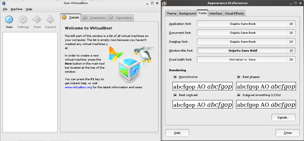
As you can see, most of my font settings are at the default "Sans" font. The "Sans" and "Sans serif" fonts, at least in recent Ubuntu releases, refer to the corresponding DejaVu font variants (previously it was Bitstream Vera). However as I found out through experimentation, whilst Qt is obeying my font settings, the generic "Sans" font seems to mean something completely different (at least to Qt4). If I instead specify the DejaVu fonts directly in my font settings, the correct font rendering is used:
So that's it: if you're using GNOME and you seem to get a Qt font rendering that doesn't match your GTK font rendering, try using a more specific font. (I haven't got a clue what "Sans" actually means to GNOME, but it doesn't appear to be a font in it's own right.)
Comments